Beacon Air: Redesigning the worst part of your vacation
End-to-end mobile booking and check-in for a new low-cost airline, including a first-round failure, an honest pivot, and a design process that got better by listening.
Low-cost airline booking is notorious for information bloat, obscured layovers, and dark patterns. A new airline needed a mobile experience that felt trustworthy from the first tap.
Three rounds of testing, with a documented failure and full redesign of the search experience based on user feedback. Every insight is grounded in what users actually did.
Round 3 testers moved through the booking flow without confusion, located target flights without assistance, and booked with no hesitation.
What low-cost carriers get wrong, and what Beacon Air needed to fix
Beacon Air was a Designlab UX Academy capstone. The brief: design an end-to-end mobile experience for a fictional new low-cost airline from scratch.
The client wanted deals prominently featured and to be there for customers "at their lowest point in the journey." When I asked users what that meant to them, the answers were delays, cancellations, lost luggage. These are things no product can fully fix. In those interviews, the product goal evolved: make sure the booking experience itself is never the low point.
If you can't fix the hard stuff, at least don't add to it.
Information bloat
Low-cost carrier results pages bury the flight in upsells and fine print.
Obscured layovers
Connection times are styled to be easy to miss, and suddenly you've booked a connection you can't make.
Calendar friction
Date-range pickers create unnecessary decision load. Confirmed by users before building.
Price opacity
The cheapest flight is rarely the most visible. Users shouldn't have to hunt for it.
Key decisions in the flow
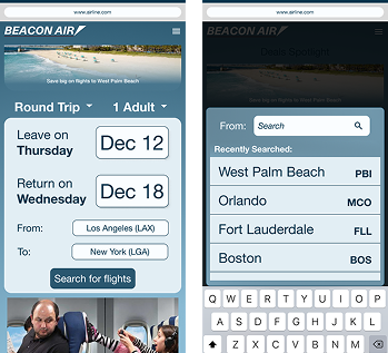
Departure and return selected sequentially with no date-range calendar. Each decision gets its own space.
Typing "New York" surfaces LGA, JFK, EWR, and an "all metro airports" option. Users get cheaper alternatives without knowing every airport code.
Results sorted by lowest price. Layovers and short connections flagged with icons and plain-language labels — tradeoffs visible before you commit.
Gate changes, delays, arrival updates surfaced as browser notifications for travelers when and where they're actually useful.
Flight results — visual logic
DEN → JFK · 7:15 AM
✓ Lowest price
DEN → LGA · 9:40 AM
⏱ 2hr layover · ORD
DEN → EWR · 6:00 AM
→ Short connection (42 min) · MDW
Designs in action
Round 2: a documented failure and an honest pivot
To meet the client's deal-featuring requirement, I placed suggested destinations below the search bar on the flight search screen. It failed in testing immediately.
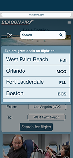
An attempt to add promotional fares to the search screen was a failure
Revised screens for testing with no irrelevant info
Every tester's eyes went to the suggestions instead of the search bar. Users couldn't locate the search bar at all. The label "Explore great deals on trips to:" wasn't read. Users assumed their destination would appear in the list without searching. Post-session: universal negative response. Confusing at best, annoying at worst.
Replaced suggestions with recent searches and favorited destinations. The things that users actually want at that moment. Deals moved to the homepage, below the booking section but above check-in. Still visible. No longer in the way.
The ads weren't the problem. The placement was.
Three rounds. One pivot. A flow that works.
The thing I'm most proud of
When Round 2 failed, I didn't defend the design or iterate around the edges. I went back to the brief, found a better solution for both the client and the user, and rebuilt.
Not taking feedback personally is a skill. This project is where I proved it to myself.