Provisioned: Cook what you have. Love what you make.
A recipe app that starts with your fridge, not a grocery list, designed to reduce food waste and get people actually cooking.
Kitchen management apps demand a huge initial lift — logging every item, every expiration date — and then do nothing useful with the data. No next step. No recipe suggestion.
Flipped the model: start with a pre-populated pantry list users can edit in 15 seconds, then lead with recipes. Not kitchen management — a recipe app powered by what's already in your fridge.
Round 2 testers didn't just say they'd use it — they wanted it to exist. One of the strongest positive responses across all three Designlab projects.
The idea came from leaving my desk
Provisioned started as a Designlab UX Academy capstone with a fully open brief. I was stumped, so I decided to go get groceries to clear my head. Somewhere between the door and the store, I had the idea.
Originally it was a kitchen management app: log your food, track what you're out of, build a grocery list. Through research, the scope shifted. The real opportunity wasn't organization, it was the moment after organization. What do I actually cook with what I have?
Current home cooks — habits, frustrations, grocery patterns.
How people decide what to cook and when they turn to the internet for recipes.
Kitchen management apps that required full inventory setup and delivered no meaningful next step.
Almost everyone surveyed said they look at recipes on the internet daily, even when they have no intention of cooking. People love recipes. The app needed to be built around that behavior, not around inventory management.
Every kitchen management app required users to start from an empty fridge, logging everything at once, including expiration dates. That's a massive ask. And after all that work, the payoff was a list. No recipe. No suggestion. No reason to come back.
A competitor's screen, which needs a full manual search
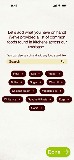
Easily adding foods on Provisioned
From kitchen management to recipe-first
Round 1 testing was almost too smooth. Users figured out the app, walked through it without friction, and when asked if they'd use it, said "Maybe. It's a good idea." Nobody was eager to convert off their Notes app. That lukewarm response was the signal. I went back to my interview notes and found the answer already written down.
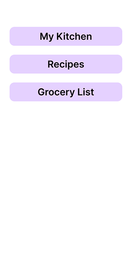
Menu-based navigation between kitchen, recipes, and grocery list. Functional but flat. Users understood it but didn't want it. No emotional hook.
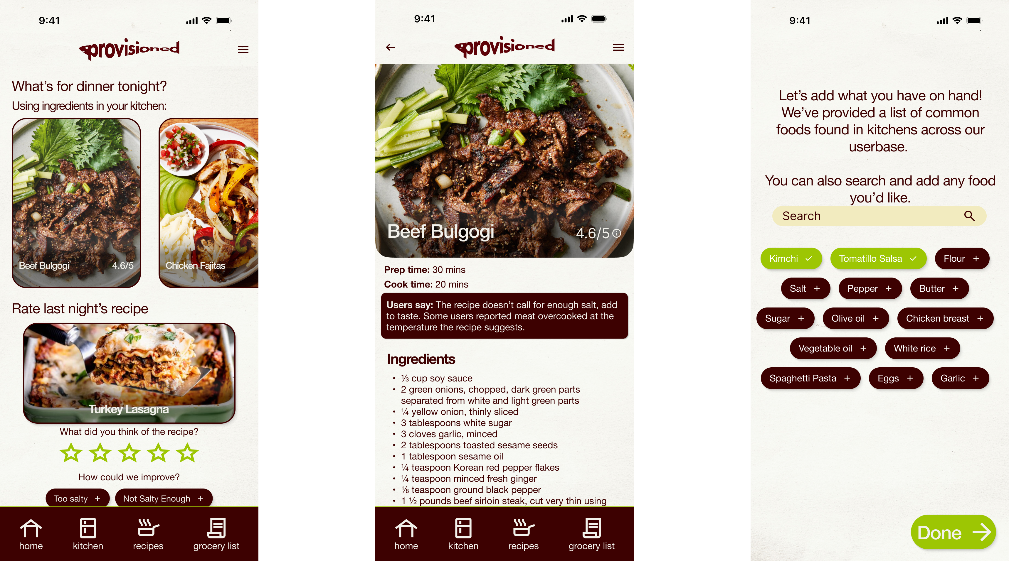
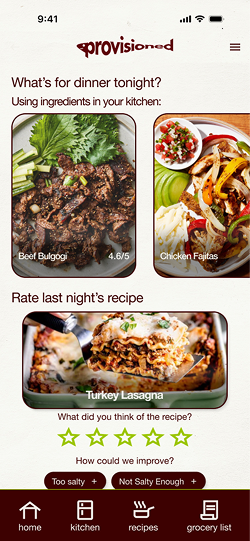
Homepage rebuilt around food photography and recipe suggestions. Kitchen and grocery list became supporting features, not the headline. Users wanted it to exist.
From a main menu with sections...
To a recipe-focused app based on user feedback
The other major design decision was onboarding. Competitors made users start from an empty fridge. My mentor asked if I could suggest the starting inventory instead. That evolved into, "What if everything was pre-selected and users just removed what they didn't have?" Setup now takes about 15 seconds.
Common western kitchen staples pre-selected. Users remove what they don't have, add what's missing, and set dietary restrictions. 15 seconds. Done.
Full-bleed food photography, not text lists. The app leads with what people already love doing — browsing recipes — and grounds it in what's actually in their kitchen.
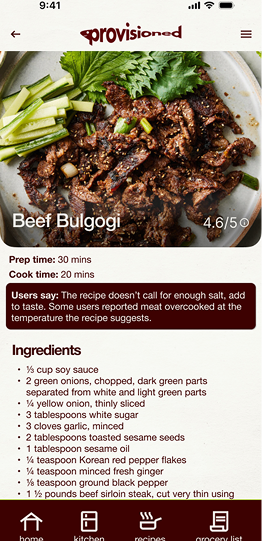
Screen stays on while cooking. If a user is missing a garnish or minor ingredient, the app asks if they want to skip it rather than blocking them from the recipe entirely.
A photo of last night's recipe appears the next morning with a star rating and suggested improvement tags. One tap. Recorded. Used to improve recipes across the platform over time.
An example recipe with feedback
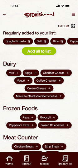
Your grocery list
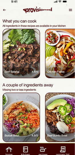
Three tiers. One honest picture of your kitchen.
The recipe suggestion structure came from how I actually cook: substituting ingredients based on mood, planning ahead around what I know I'll buy. Recipes are surfaced in three tiers based on what's in your kitchen right now.
Everything you need, right now
Recipes you can make with exactly what's in your kitchen. No exceptions, no substitutions required.
Missing one or two things
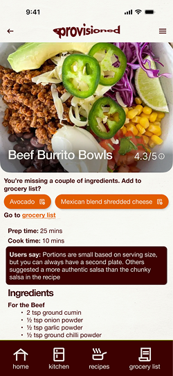
Recipes within reach. Missing ingredients can be added to your grocery list with one tap or skipped if they're optional.
Worth shopping for
Recipes further out that match your taste. Save them, add missing ingredients to your list, and come back when you're ready.
The system is strict about what it shows. If you don't have tuna or egg noodles, you won't see tuna noodle casserole. If you're out of eggs and have ground beef, you might see meatloaf in the "plan ahead" tier, a nudge to grab eggs on your next run.
Recipes based on what exists in your pantry
A recipe with a few ingredients you don't have
Two rounds. One pivot. Users who wanted it to exist.
App was usable and logical. Users had no criticism and that was the problem. "Maybe I'd use it" isn't a product people love. Went back to interview notes and rebuilt around recipe discovery.
Significantly stronger response. Testers engaged with the recipe feed, understood the tiers, and asked for one addition: a custom feedback tag field alongside the suggested ones. Added in final revisions.
The thing I'm most proud of
The pivot happened because I went back to my own interview notes. Almost everyone had said they looked at recipes online every day. I'd written it down and moved on. When Round 1 fell flat, I went back and found the answer already sitting there.
Good research only works if you use it. The notes weren't just documentation, they were the brief for the second version of the product.
Round 2 also taught me something worth keeping: when users have no frame of reference for a product, they can't be critical. It's not a failure of testing, but it's a sign I've made something new and unexpected. That said, a new round of testing with previous testers might make an even bigger difference.